Career site design for an e-document management company
visual concept, UI design, art direction for animation, illustrations & visual assets
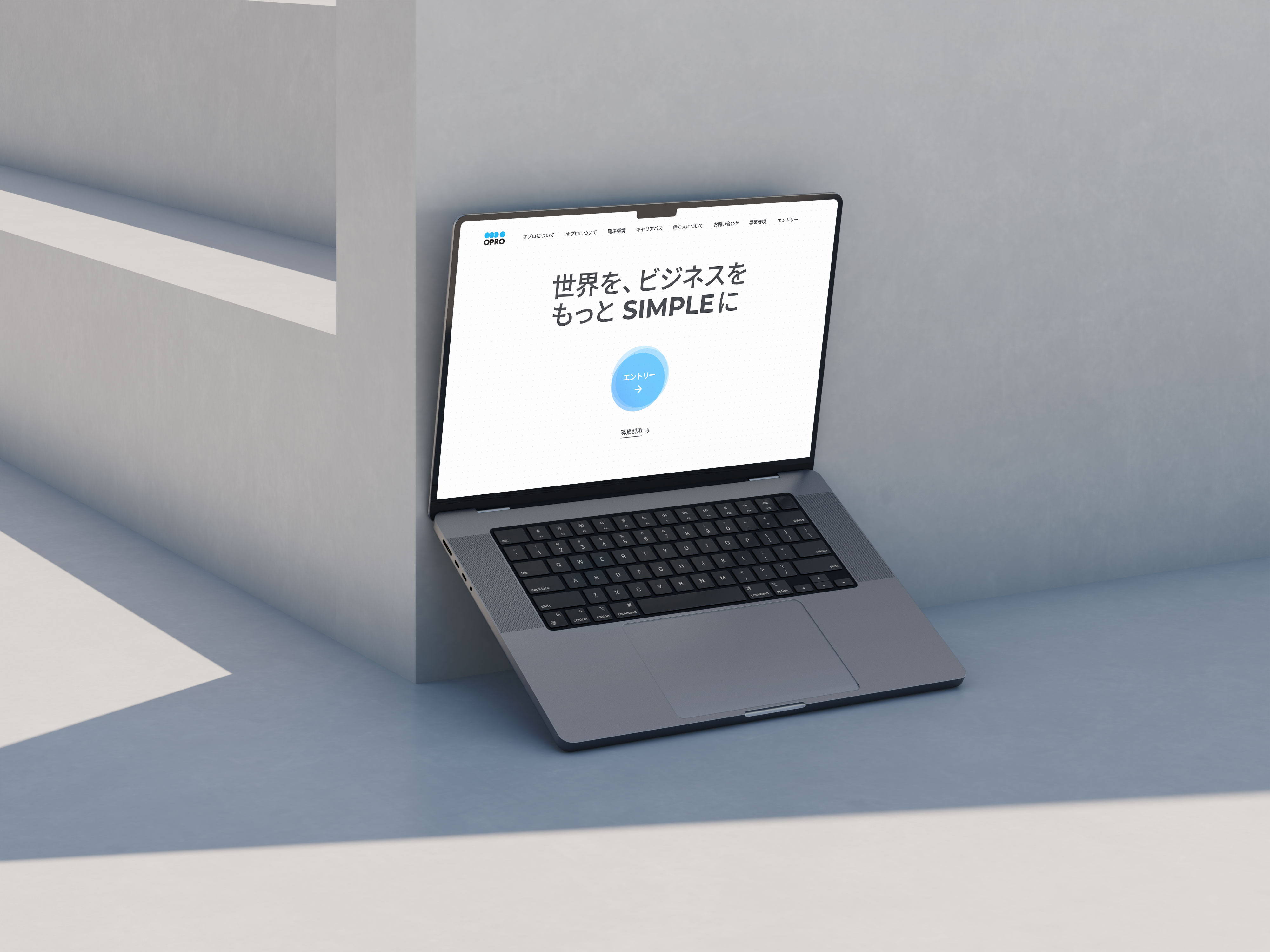
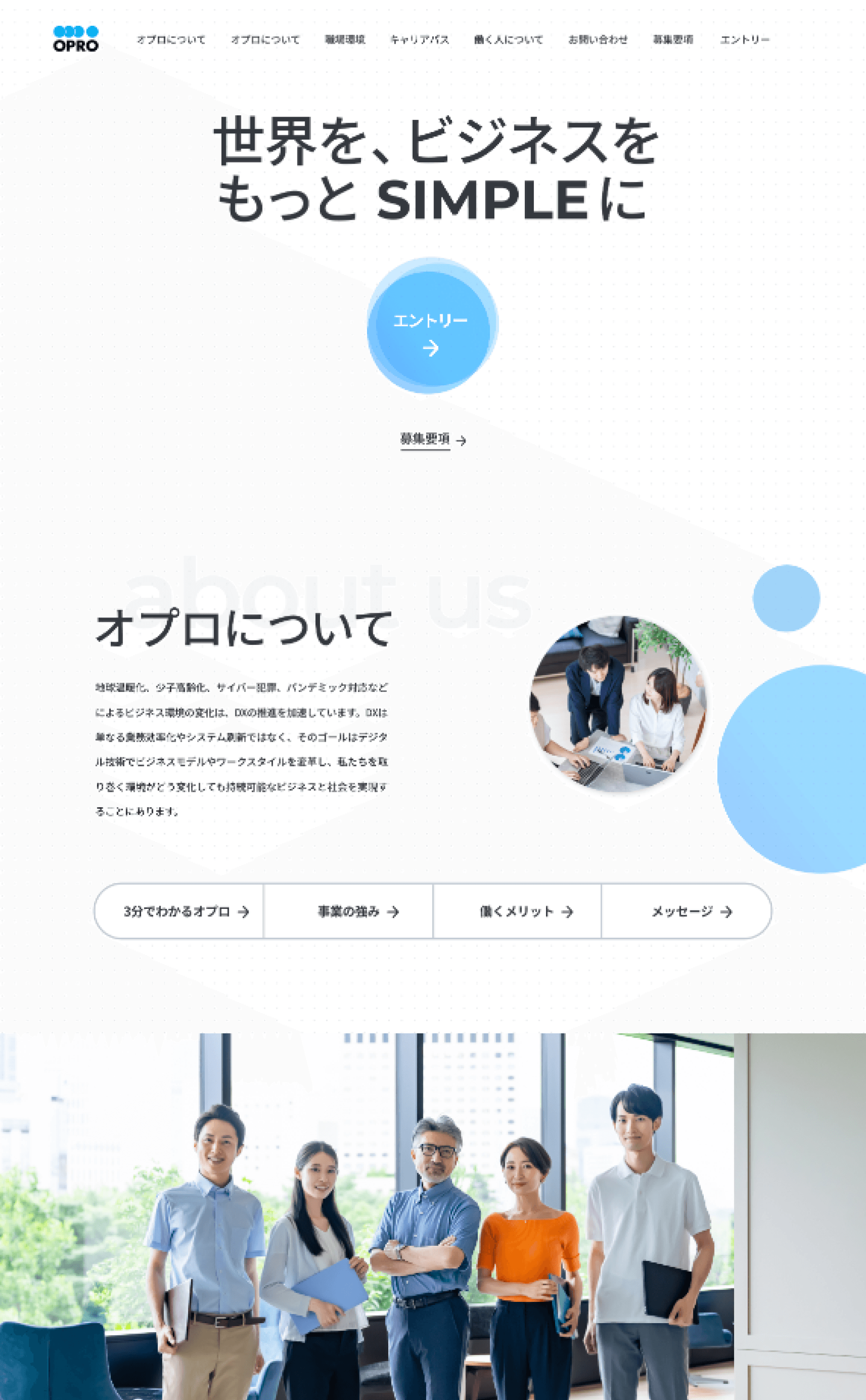
The company logo consists of four blue circles, so I decided to make blue the primary accent color and the circle shape the key visual element. This created a clear association: blue circles — it’s Opro.
To emphasize Opro’s core idea of simplifying the world and business, I created a clean, minimalist design with plenty of white space. The visual impact was enhanced through gradients in blue shades and the light, "floating" animation of the circles.




To create a stronger emphasis on the idea of order, I proposed
the concept of an opening animation, which we developed collaboratively with the project manager and motion designer.
Scattered geometric shapes — circles, triangles, etc. — gradually come together to form a single circle. This metaphor reflects the essence of opro: organizing the complex and fragmented, transforming it into something simple and unified.
One of the tasks the project manager brought to me was the article page featuring an interview with the company's leadership. He suggested we design it based on the Japanese cultural concept of honne (本音) / tatemae (建前), where honne refers to a person's true feelings and thoughts, while tatemae represents what they say out of politeness and in accordance with social norms.
I proposed turning the article into an interactive experience, allowing users to choose from a variety of questions, tailoring
the content to their interests and making the interview more engaging and easier to navigate